Redesigning the experience behind a $15M Training and Enablement business
Role
User Experience Designer
Timeline
One Month
teams
Training and Enablement, Project Management, Curriculum, Engineering
Background
Kinaxis delivers cloud-based supply chain management software that empowers businesses to make agile, data-driven decisions. Their AI-powered platform transforms complex operational challenges into strategic opportunities across multiple industries.
With that, Kinaxis understands that powerful software means nothing without user empowerment. Their training and enablement platform bridges the gap between technology and user proficiency, transforming how professionals interact with and leverage sophisticated supply chain tools.The two fold digital solution comes from:
The Ask
Kinaxis aimed to consolidate fragmented training resources into a user-friendly external platform, transforming how customers access learning paths and certifications content (and more). The initiative focused on creating an intuitive hub that simplifies content accessibility within their Training and Enablement ecosystem.
Onboarding and kickoff
I quickly aligned with key stakeholders during the kickoff call to clarify project goals and set clear expectations for my one-month contract. While I would be the sole designer on this project, I met daily with a Senior Project Manager to ensure my processes were closely aligned with the Kinaxis vision and met their goals. My direct manager, VP of Training and Enablement along with the Director of T&E and I aligned weekly to review milestones and overall progress.
opportunity
Kinaxis recognized a critical opportunity to enhance their Training and Enablement offerings. After a comprehensive content audit by the Training and Enablement team, it became clear that valuable training resources were scattered across two password-protected customer portals, limiting accessibility and visibility. The external website lacked essential information to support both prospective and current customers effectively.
The team envisioned a consolidated, user-friendly solution: migrating key training content to the public-facing website. This initiative aimed to streamline access to learning paths, courses, and certifications, empowering users to easily navigate their professional development journey within the Kinaxis ecosystem. The goal was to create an intuitive, centralized hub where users could quickly identify and access the resources needed to achieve specific certifications or enhance their skills in targeted areas.
current state
The following images depict the current state of the website pages slated for redesign. As a contractor within the Training and Enablement team at Kinaxis, my scope of responsibility encompassed these five key pages within the broader Kinaxis digital ecosystem. Based off of the current state audit, I identified areas of opportunity for the interface. This project was not limited to keeping page titles and information consistency if it did not support the initiative. From a current state audit, I identified key areas of opportunity.
Research
taking a dive with information Architecture
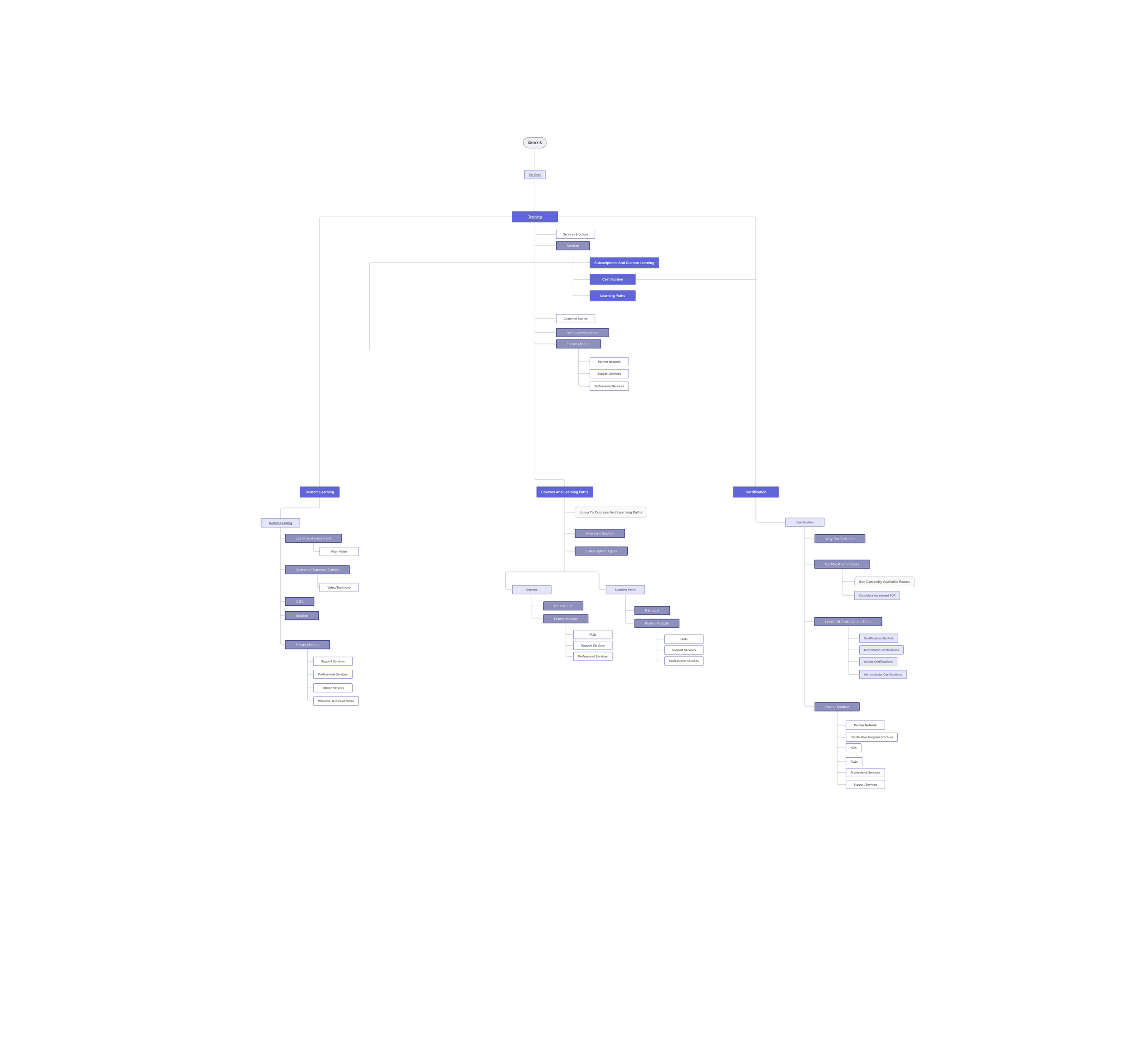
Coming on to this project as a contractor, I had to quickly immerse myself in the business, users, and areas of opportunity for this project. With constraints of a 30 day timeline and minimal documentation of research, I decided to being this project with utilizing information architecture to solve the usability and user experience opportunities for the website. Information architecture would encourage the discovery of usability issues, content repetition, lack of information, and opportunity for a streamlined experience.
Takeaways
Under the meticulous audit, I was able to establish which areas of the website were critical and most valuable to the training team based off stakeholder conversations and repetitive content. Further, I was also able to establish items that would be out of scope for my project, and could be included in future state guidance.
Actionable insights
Low-fidelity wireframes
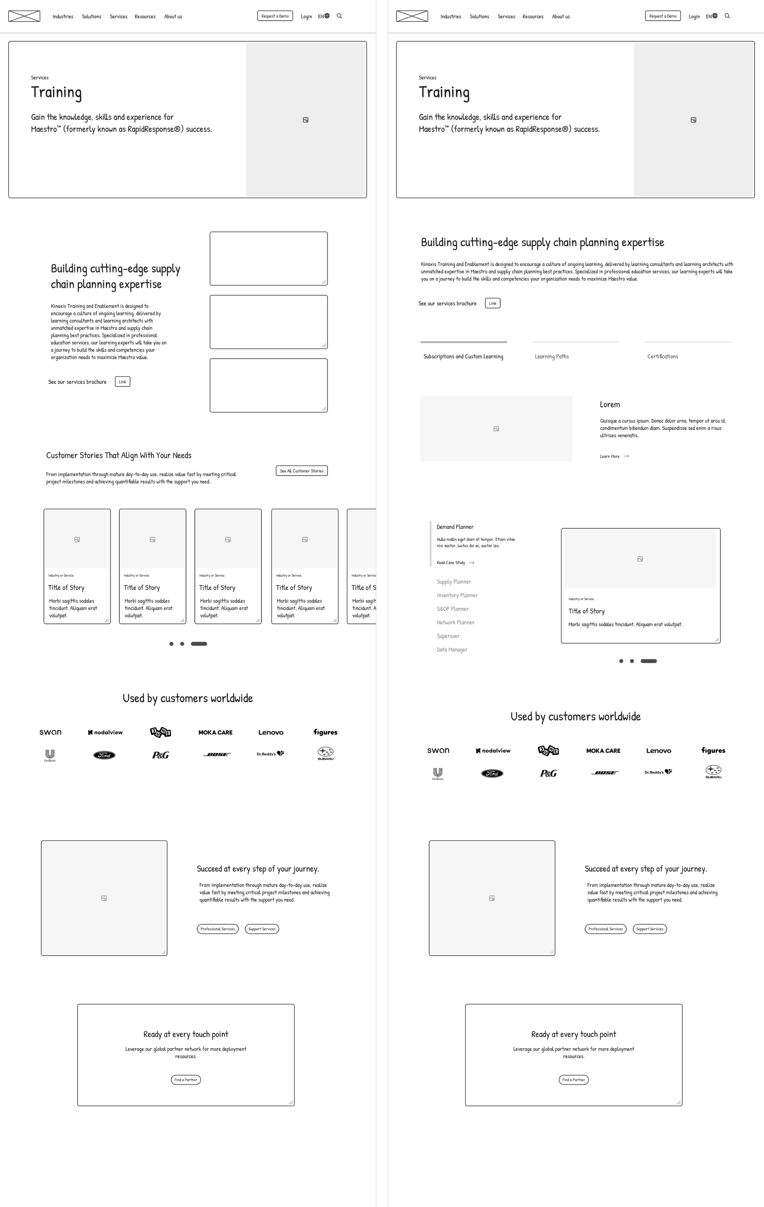
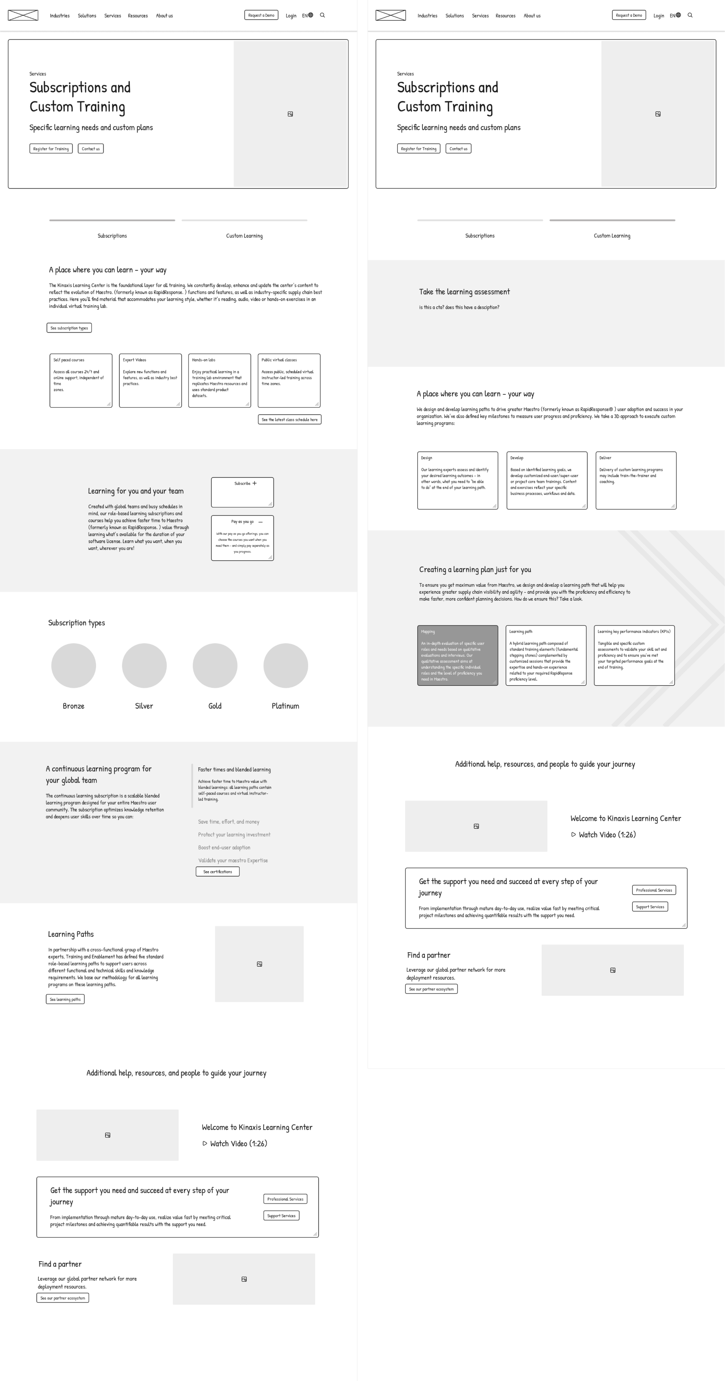
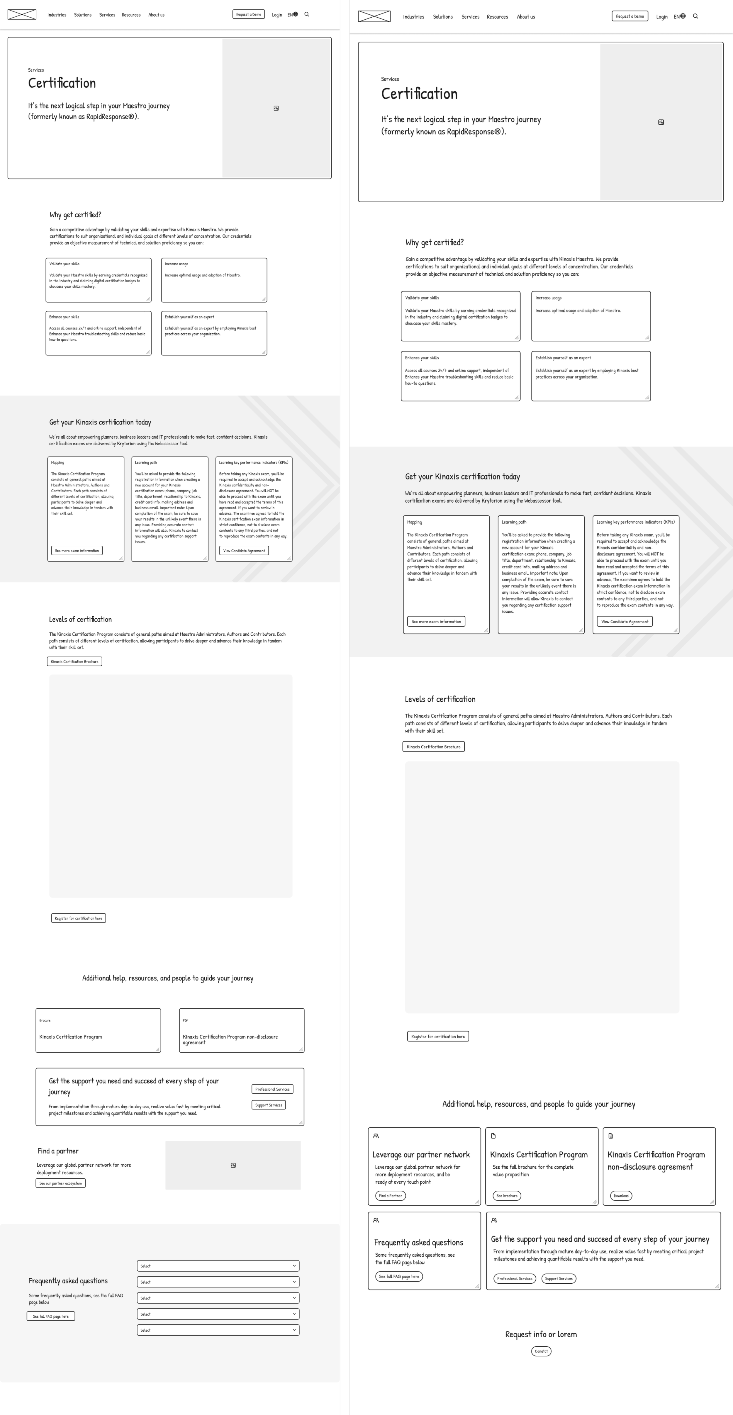
I began wireframing based off of IA consolidation, simultaneously incorporating UI updates. Meanwhile, I focused in on the current design system to apply consistent design elements while expanding the system within the interface, for example, utilizing their commonly used arrow to extend their branding across the website. My main goals while designing this experience was to create a system design that was scalable for both designers and engineers as this organization is growing quickly, and there was new curriculum and training development in progress.
*Additional guidance on formations and blocks
Design system
While the design system for Kinaxis was already established, I wanted to highlight the parts of the systems that I used, and elements that I created in one place for engineers to refer to. Items like color systems, spacing, an typography remained consistent with design development. Elements like cards, chips, and dropdowns were created. Beyond that, I provided additional guidance for formations and blocks I created and implemented throughout the website, making this a scalable design for future teams to expand and engineers to develop.
(a few) final screens
After sign-off on mid-fidelity websites pages, I began design development on high-fidelity. While I created over 25 screens, most of which is owed to “Courses and Learning Paths,” due to the amount of specific scenarios and unique use cases of those pages, these are the six pages that display the work I created.
High Fidelities
Courses and learning paths
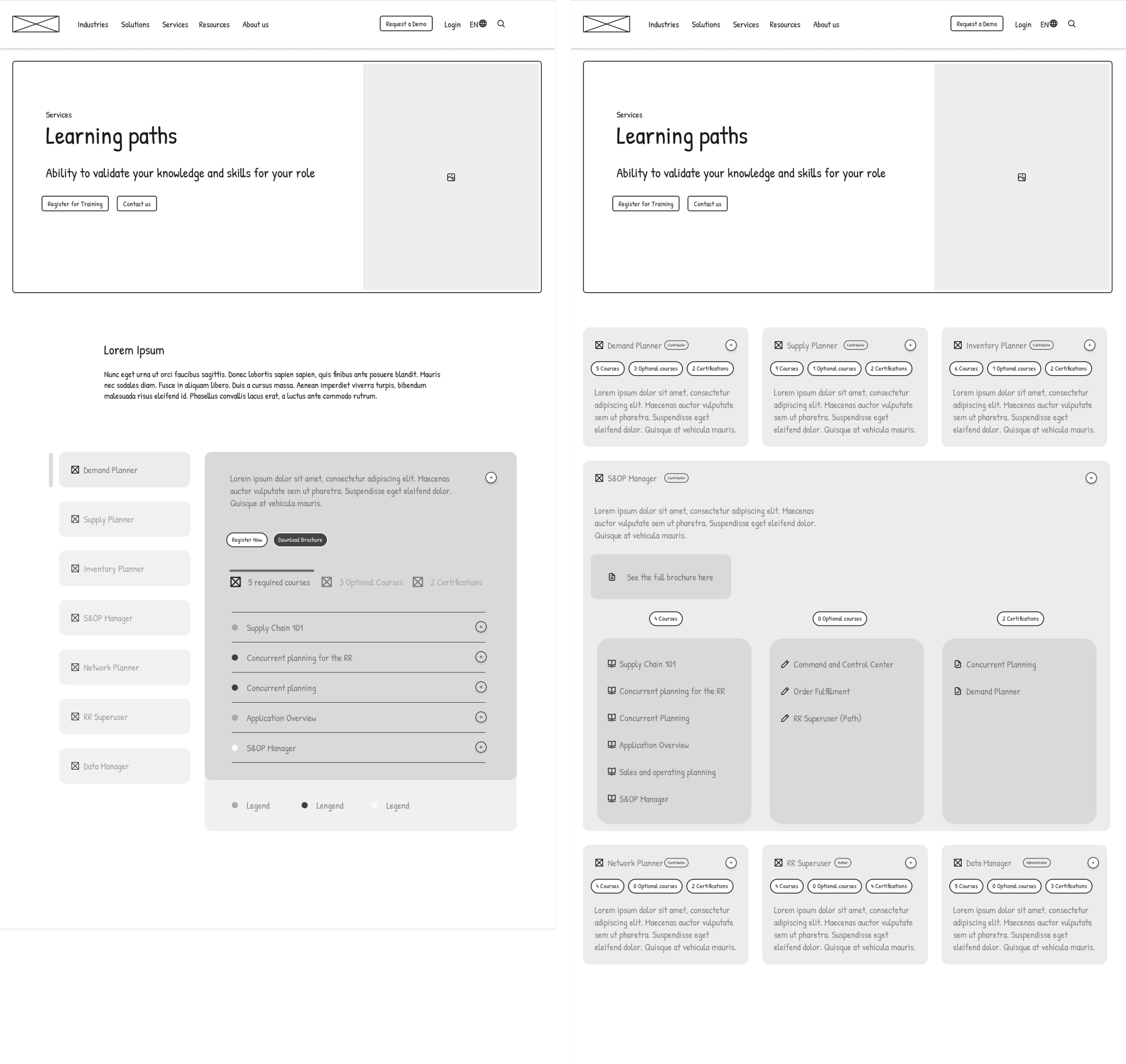
The solution for the courses section of this page clearly uses chips to allow users to filter by functions, and find courses that align with that function. In this use case, the Demand Planner will find courses they can take individually that will help catalyze their experience in learning the Kinaxis software. Users can also see what other functions are applicable to specific courses.
key features
While the entirety of this project improved usability, structure, and visual elements of these pages - there were key features that transformed the experience for users. The following features and designs highlight crucial parts of the Kinaxis customer experience that were not previously displayed on the website. The information below was only displayed in a PDF form behind their learning center that paying customers could access. The ability to streamline this experience for all customers in their external website is incredibly valuable. These were key features created for scalability as the company continually grows the Training platform. By using responsive layouts, cohesive chips with specific use cases, and expandable cards, the team can easily add and remove items as necesary.
Courses and learning paths
The solution for the learning paths section of this page carries the same interface design for courses, making this a cohesive solution across the website. All of the functions are listed out as paths, and users can filter by level of seniority (e.g. Contributor, Author, Administrator). Within each card highlights required and optional courses, along with certifications available for that learning path.
Once a card is expanded, it gives a high-level overview of the course, takeaways, study guides, and ability to register for the course. Beyond that, it highlights prerequisites, required courses, certifications, and optional courses in depth if expanded further.
Certifications
When customers come to the certification page, they will be able to seamlessly find their function, certifications available links to blueprints (or study guides), and have the ability to go back to courses and learning path pages to view full course or path information. Creating this table allows a simple way to gain access to this information, while created a streamlined experience between relevant pages.
Product guidance
Given the temporary nature of my contract and the ongoing evolution of the Training team, I recognized the need for a comprehensive handover strategy. With engineers set to develop these pages after I was off-boarded, and future enhancements planned beyond my contract's scope, I focused on creating detailed design guidelines for the Training team. These meticulous instructions were created to ensure consistency and ease of replication in the future, allowing the team to confidently update and expand upon the established design framework.
Engineering handoff
The final days of my contract was geared towards ensuring the engineering teams had clear guidance and instructions for development. Their teams did not require redlining; with my comprehensive product guidance, design system, and excel handoff for copy needs - the engineering team and myself were aligned on proper development. We were able to discuss and solve possible roadblocks that could occur after my contract.
reflections
Designing the responsive interface for this SaaS organization was an incredibly rewarding experience. My passion for SaaS product design, particularly in the e-learning space, drove my approach to this project. I enjoyed the challenge of building new interface components while strategically integrating existing design system elements.
The project presented two significant challenges: navigating the contract's tight timeline and reimagining the "Courses and Learning Paths" page experience. This specific page was the project's core focus, representing an opportunity to create an entirely new user experience from scratch. Despite the compressed timeline, I leveraged stakeholder insights and conducted rapid, strategic competitive research to make informed design decisions that would effectively serve the target customers.
This project also allowed me to strengthen my communication skills. While I quickly immersed myself into this organization, it was crucial that I kept close communication with my project manager and the VP of Training and Enablement, my direct report. Effective communication was vital to the success of this fast-paced project, especially given the diverse teams involved. Curriculum, Training and Enablement, Marketing, and Product teams all contributed content that needed to be seamlessly integrated. Navigating these cross-functional relationships and managing multiple stakeholders' inputs was crucial for ensuring timely delivery and a cohesive final product.


