Creating digital experiences and a brand refresh for a global Fin-Tech organization on iOS and Web
project Background
Role
Experience Designer
Timeline
Six Months
Internal WONGDOODY teams
Strategy, Business Development, Experience Design, Project Management, Client Partnerships, Creative Director
Client-facing teams
Brand, Product, Marketing
Project Brief
The first part of this brand refresh project had a strategic focus, with a revitalisation of the brand positioning that leveraged deep insights from internal employee and external client stakeholder interviews. From this work, we’ve developed a compelling positioning as well as mission, vision, and purpose statements, so now we need a visual identity that will help Computershare achieve its growth goals.
The second part of our brand refresh project, which has a creative focus – a reimagining of the look and feel of the Computershare brand, in different forms of expression both digital and physical. With a focus on brand, the XD team will apply branding and UI elements across B2B/B2C products, web screens, out-of-home advertisements, and other marketing applications
The Ask
Create a refreshed visual identity for Computershare that reflects the new brand positioning, is unique and ownable in the market, and leaves a confident and inspiring impression with clients and customers.
This revived visual brand will be Computershare’s big opportunity to reengage current clients, while also making a captivating first impression on millions of potential new customers – a moment we will only get once as the company takes advantage of emerging markets.
Opportunity
Misalignment
Computershare’s current visual brand has not been living up to the promise of the company’s services and products – employees and clients alike have been saying for years that it feels dated, dull, and clunky compared to the whip-smart service clients experience from Computershare specialists.
Confusion
Employees have expressed frustration with the lack of flexibility and guidance on how to adapt branded elements to the specific needs of their lines of business, prompting designers to create their own rogue systems and brand representations.
audience
B2C CLIENTS (RETAIL)
An individual who is using one of Computershare’s tools in relation to a client company, e.g., a person managing their share portfolio
B2B CLIENTS (INSTITUTIONAL)
An organisation that pays Computershare for services, e.g., a company issuing shares will use Computershare to manage their share register and the relationship with shareholders
COMPUTERSHARE EMPLOYEES
The 16k+ people who work across Computershare’s five lines of business in 22 countries around the world
strategy and branding
Brand insight: Computershare has the heritage and tenacity to go after the biggest opportunities.
While other companies were busy talking about how complex, high-risk, multi-market deals were too hard, Computershare was trailblazing with visionary clients, building solutions from the ground up, and pursuing new breakthrough opportunities, all while raising the bar for the entire industry.
Brand positioning: Computershare confidently challenges convention.
It’s a company of experienced, trusted changemakers who pioneer innovative solutions that help move the financial service industry forward.
Brand archetype: Computershare is at its heart, an explorer that believes in pursuing freedom.
They are bold, brave, and purposeful, constantly thinking outside the box.
Foundational Design
Brand Book
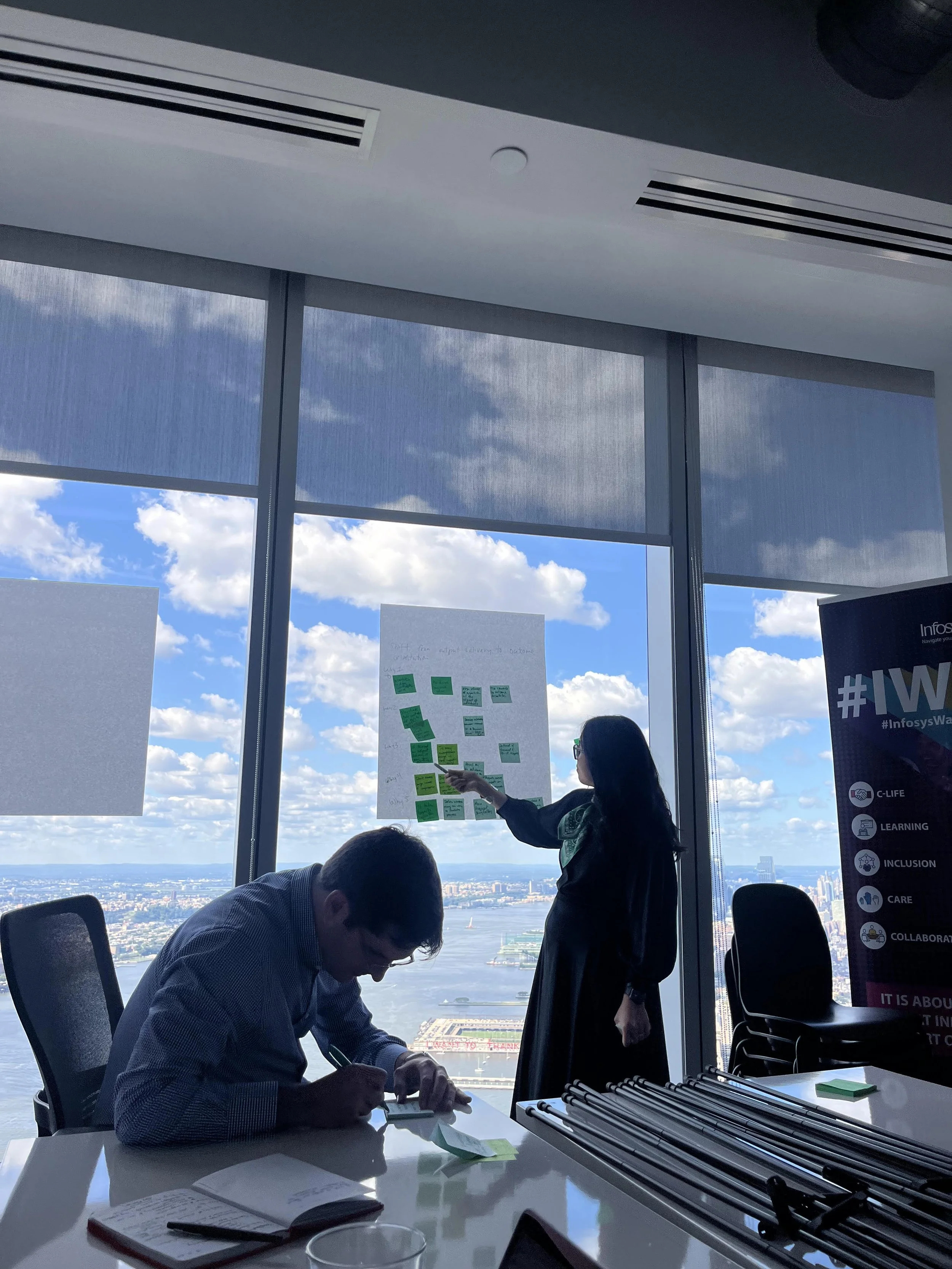
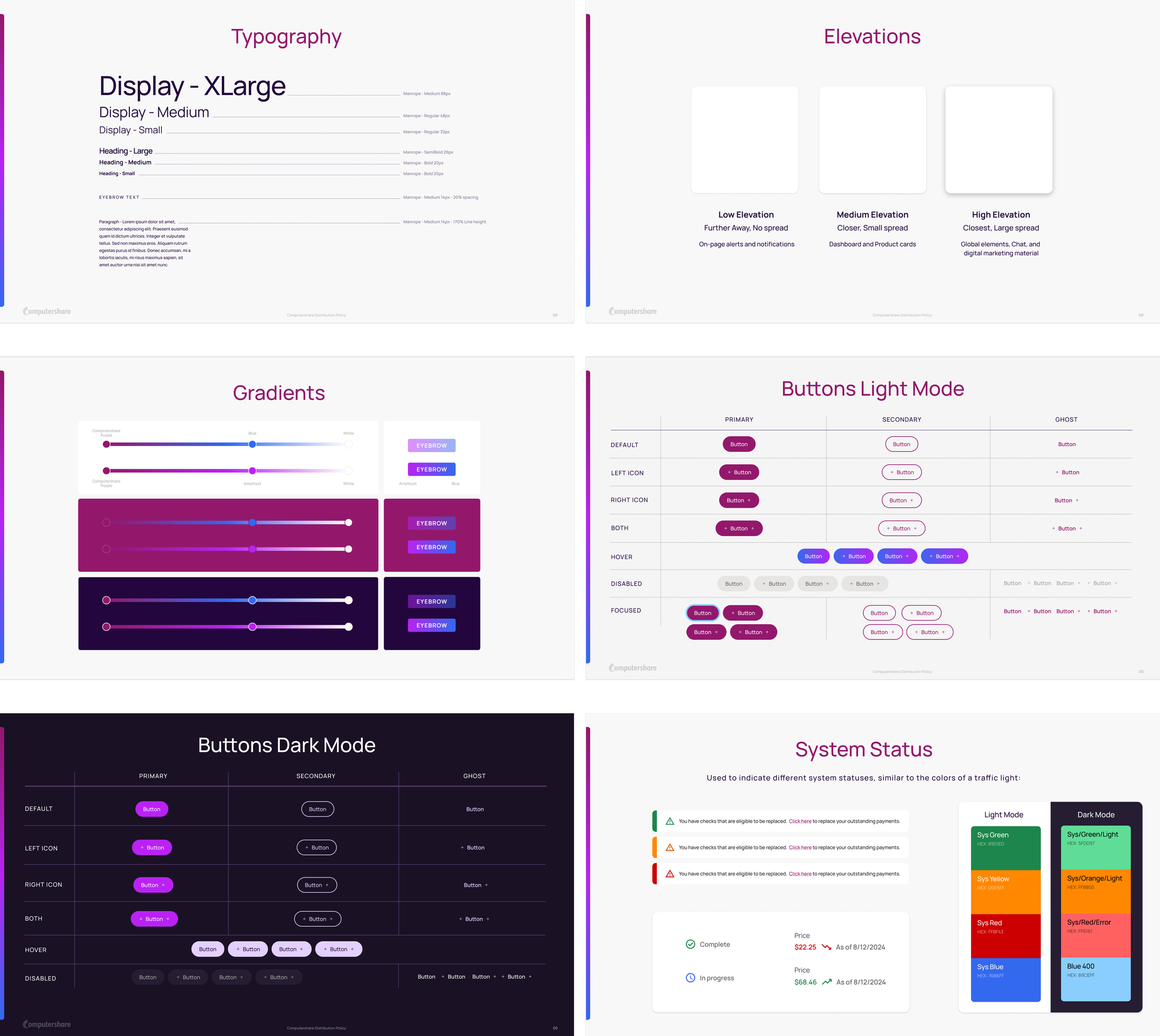
After solidifying the strategy with Computershare, the creative director and I collaborated in creating the brand book. The brand book would reflect color and logo usage, typography, layout guidance, and social and marketing applications. The brand book was in continual review even as we were developing low/mid fidelity wireframes, so our varying teams could see elements and branding applications in use.
Accessibility
Throughout the process of designing the brand book, we paid meticulous attention to accessibility guidelines. In our brand book, we emphasized what not to do in alignment with accessibility standards, allowing for teams to spend less time testing their products and have a clear grasp on what is or is not accessible. We achieved this by continually tested our brand book elements and designs against WCAG2.1 and A11Y guidelines to ensure accessibility to users.
Brand Book - Identity
Brand Book - Layout
Brand Book - Color
Design Development
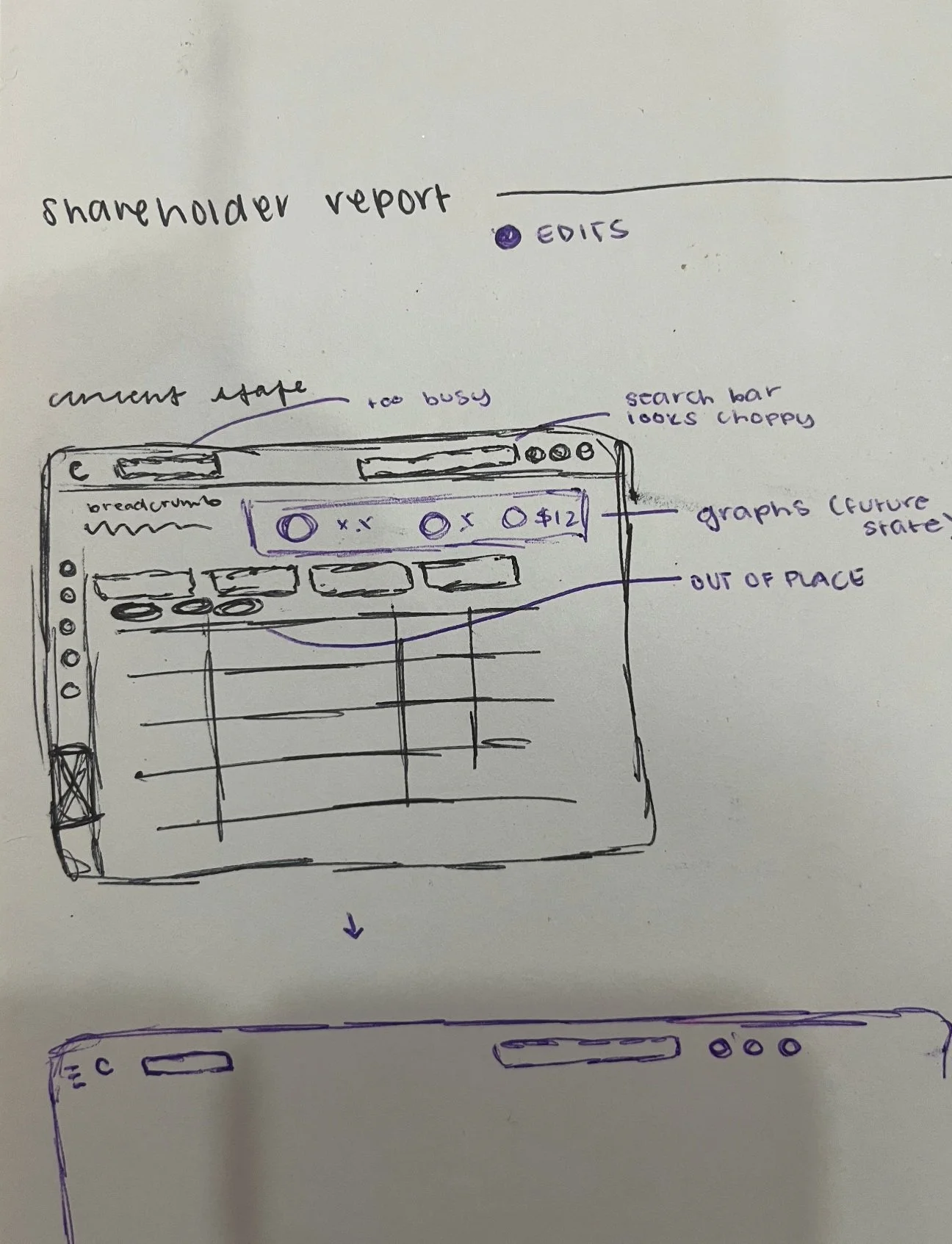
Due to various constraints, including limited design development due to budget constraints, we had to rapidly iterate on designs. Regardless, as we were actively designing the brand book, I was simultaneously wireframing designs and applying brand book elements to these designs and presenting to internal stakeholders and client-facing teams. I applied feedback for the varying use cases of teams across our designs in a rapid iteration process.
Product Guidance
While we moved from mid-fidelity to high-fidelity, our team and I established meticulous guidelines on product screens to allow future Computershare teams to have comprehensive guidelines on design elements.
B2B versus B2C
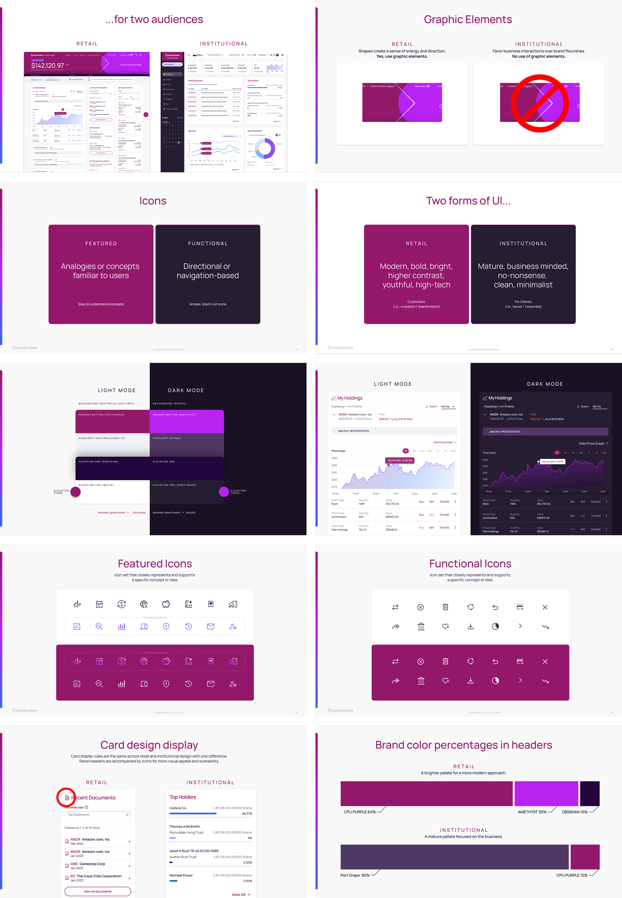
Our product deliverables consisted of screens that were institutionally focused as well as retail focused, emphasizing the difference on B2B and B2C customers, as identified in our audiences. Overall, the screens apply the design system consistency throughout products, but contain distinct characteristics for their use cases and audiences.
Data Visualization
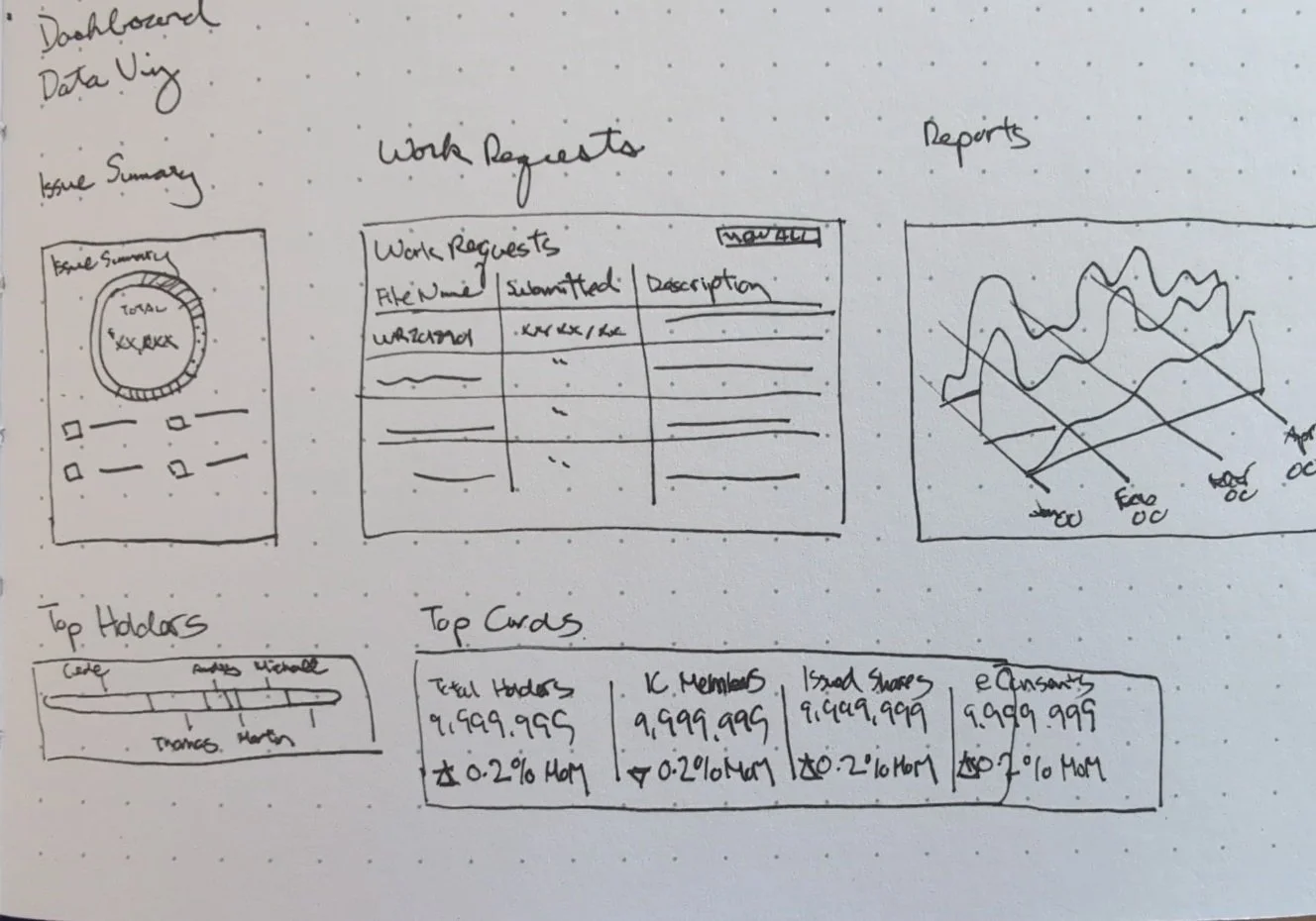
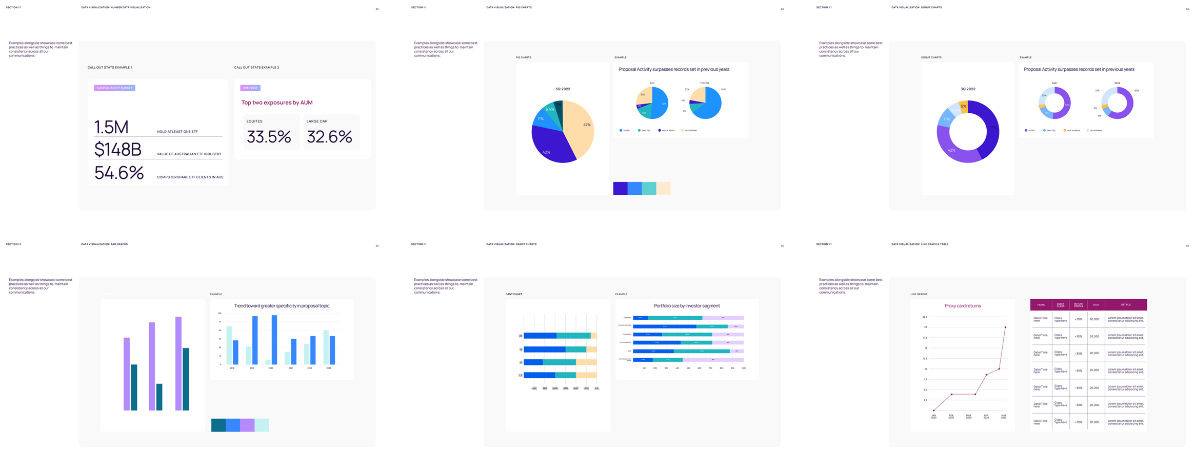
As we began wireframing and developing screens, we recognized the importance of varting types of data visualization in the complex Computershare products. In part with our handoff documents including guidance on elements, we included data viz guidance for their most used cases.
High-Fidelities - Institutional
While collaborating with Computershare teams and assessing different audiences, user needs, and use cases, we found that a more mature and business minded interface and experience at large would best service this audience. These interfaces keep consistent information across the page while innovating the design with color applications from the brand book and clear data visualization for a seamless experience for their B2B clients.
High-Fidelities - retail
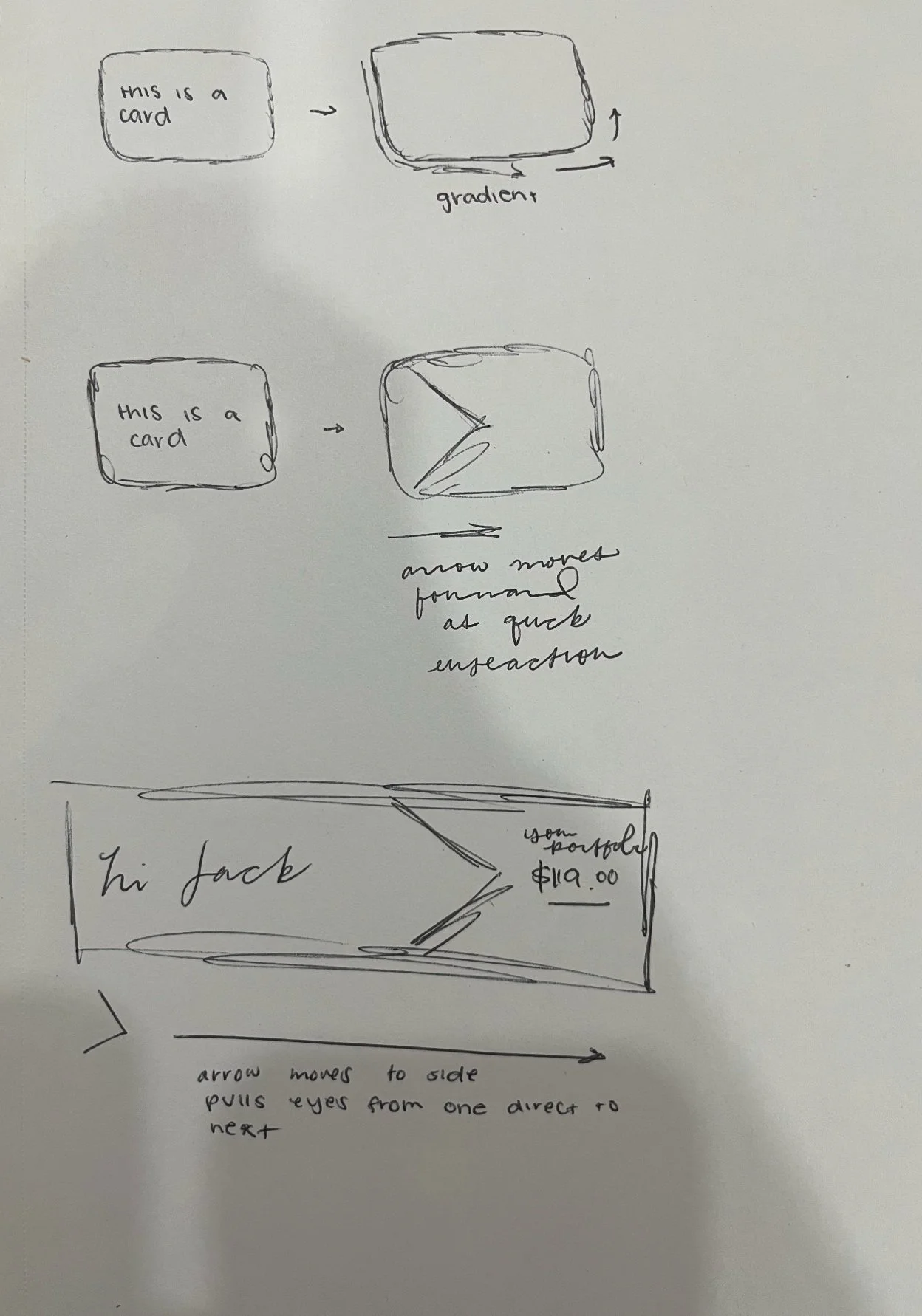
After establishing a distinct different between Institutional and Retail use cases, we found that we could hone into the branding guidance for Retail Screens. We are able to utilize distinct, brand-focused shapes in these designs. Retail screens are able to utilize shapes found in the design system to indicate progress or draw attention to other elements on pages. This solution was delivered across iOS and web in dark and light mode.
High-Fidelities - web
We concurrently worked with the marketing team to align product screens to external web pages (and out of home advertisements not included in this case study). The marketing team emphasized a strong need for a distinct brand, which we delivered in our brand book. Including strong design elements from the brand book on their external website pages allowed for Computershare to have a strong visual brand recognized globally.
Reflections
This comprehensive project allowed me dive deeper into my visual design skills while working with cross-functional internal and client-facing teams. It was an incredibly rewarding experience that expanded my knowledge and experience in branding, data visualization, and the fin-tech world.
Collaborating with global brand, marketing, and product teams revealed diverse needs across departments. Brand teams sought extensive, distinctive guidelines; marketing required specific applications for out-of-home campaigns; and product teams needed audience-specific, product-focused branding. Our challenge was to create a cohesive solution that addressed these three distinct areas within a global organization, ensuring consistency across all platforms. My team and I were successfully able to understand the needs of these different teams within the organization and deliver a successful solution that catered to all of them successfully. I learned how to build strong client-relationships while navigating an ambiguous project and solving challenging problems.
Data visualization quickly became one of the most captivating aspects of this project. The challenge of translating complex data into visually compelling representations proved more intricate than initially anticipated. This required crafting an expansive color palette capable of distinguishing multiple data points on comprehensive screens and abiding to accessibility standards on both light and dark mode. The process deepened my appreciation for the intersection of aesthetics, functionality, and accessibility in design.


